Ironically, in opposite to the title of this post, I don’t often choose a palette when starting a painting. More often, I let my subject inform the colors. And generally I choose to paint an image based on the colors already present. I hardly ever choose to paint an image that does not have amazing colors. Thus, choosing a palette isn’t so much of “choosing” as “finding” colors that already exist within the subject.
With that said, there have been a few times where, as an exercise, I’ve tried to consciously choose a color palette, or to be more deliberate with choosing my colors. I feel like choosing is a different act and has it’s own advantages and drawbacks to finding a palette. Hopefully, using a little bit of both helps conceive a painting with a strong, clear color scheme and produce stronger work.
Here are some specific choices I’ve made in color palettes, as well as a description of their purpose:
Roma and Nice pink and purple sunsets:
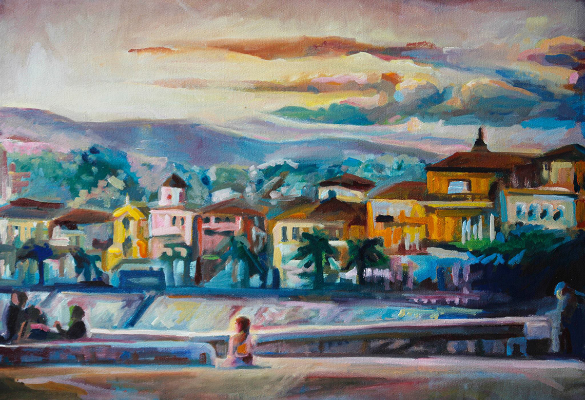
 I just completed my “honeymoon” series, where I painted one image from each of the four cities we visited. I wanted views that weren’t typical, but still were indicative of the cities they represent. Also, I found that I typically took pictures during the best time of day for lighting: near sunset.
Each sunset was captured on a different day and in a different location, so they were each very unique. However, I found that I could use color to connect the two. I deliberately used a very purple and pink palette for the incredible lighting.
T he neat thing about painting, is that even when using similar colors and purposefully choosing a scheme, the subject still imposes it’s uniqueness through the colors. For instance, The Roman street painting (bottom) matches Nice (on the top), with it’s warm pinks in the center. But towards the edges, it suddenly diverges into deep aquamarine blues, representing the cool, deep shadows of near sunset on an urban street.
Nice, being an airy resort town, has more warmth, but still touches upon some deeper ultramarine shadows (and prussian blues) near the edges too. It’s a lesser amount, which lends Nice a warmer representation. It’s cool that the same colors, but in different amounts, can create two different locations.
In both cases, I used ultramarine and prussian blues for the shadows. I used naples yellow and white plus alazarin crimson for the warmth. Prussian blues are a bit heavier, flatter (duller or muted) and warmer than ultramarine blues, so they lend a warmth to deep shadows, versus ultramarine, which gives shadows a bright coolness. Nice’s warmth was so warm, that I used more prussian blue, so that the shadows were warmer and didn’t cool-down the scene. On the street in Rome, the shadows were more bright and lively, but cool. The ultramarine represented the hustle and bustle well. Also, it was more complimentary to the warms. Nice was a lot more analogous in its warmth. But both still contained contrast and information about the atmosphere and locations based on the use of blues verses reds (which verge into oranges and yellows). If you want to go analogous but still have contrast, using colors from separate ends of the color wheel is a good choice.
Venice and Paris ultramarine and orange sunsets:

These next two paintings still related to the purple-and-pink-er ones above, but they use slightly different palettes.
I used a lot more orange and ultramarine in both. Both of these paintings represent a slightly earlier sunset hour when the sky still displays a more daytime-like blue sky. But when the sun gets so low, the clouds (Notre Dame, below) and reflections (Venice, above) gain contrast and become this awesome brownish orange, which contrasts against the bright ultramarine and cerulean skies or water.

Again, these images also have their differences, also informed by their color use. In Venice I used some purples in the near walls against a much more orange and warm walls in the back where the sun was still hitting. I used a LOT more ultramarine in the water in order to make the warm tinges of colors, reflections in the water.
In Paris, some purples were used in the water, but I use more flat, dull reds in the silhouette shadows of the cathedral in the distance, and the trees. The trees of course are “green” but in the sunset they are dark. Thus, I use a warmer, deep flat cadmium red plus blues and viridian green (an invisible compliment in order to darken the red).
Normally, blues make something recede into the distance and reds make something advance to the foreground. However, in both paintings I enjoyed flipping that so that the red-ish oranges in the distance clouds and distant walls represent the distance and that the ultramarine blues and purples and in the foreground. It’s neat to me that you can manipulate the natural properties of colors so. There is almost a limitlessness to how and where you can use colors.
 Lastly. The above series was where I really took palette-choosing seriously. I wanted to capture the same spot, in three different times of day. I used the color wheel from red to blue – purple to cycle through the day. I wanted to show how the peaceful pinks in the left-most can say tranquility, how the green can show busy nature. And lastly the blue can be a cool busy twilight/ evening.
What’s I always find neat is that while the first is red, I had to use blues and green “invisibly” in the shadows to create contrast, even if still analogous. And in the green, I had to use blues and reds to warm up and cool down parts. And in the last blue one comes full circle (that’s why it’s a color wheel and not a color line), almost back to red – I had to use reds to create the purples.
—-
I hope this shows how, while intentional colors are important, the act of choosing a palette is so much more than just your own choice. So many other factors and elements come together to form a successful palette. Besides, no matter how you limit or expand your palette, ALL the colors are needed to form depth, contrast, shadows, and highlights. An intentional palette can be decided by differences in usage and amount of certain cool or warm, bright or muted colors.
For more information regarding warm and cool, analogous and complimentary, and bright and muted, see these two previous entries:
test comment