Note: I’d read this previous blog post on color theory first before starting this post, as I might be using some terms in this post, that were first explained in the previous post.
One area where I differ from many other artists, is that I don’t plan my color schemes ahead of time. However, that doesn’t mean that the color schematic I end up using for a particular piece aren’t purposeful. Here I want to elaborate on a few different ‘schemes’ I use frequently.
NIGHTTIME / Light against Darkness
 Personally, I find painting illuminated objects against the dark to be one of the easier color schemes. With daylight, you have to discover the luminosity of a subject yourself, but with illumination in the night, it practically dictates the answer for the lighting for you.
But back to color schemes… for a night scene, I generally use my richest darks, generally ultramarine and prussian blues against some bright cadmium reds and crimson/purples. Here’s the key to the purpose of the individual colors:
Prussian Blue –
A WARMER blue, that is extremely dense and dark. Prussian blue advances to the foreground of a piece, while still retaining a cooler background feeling. Blues are cool colors, but there are warmer blues than others. Prussian is one of those warmer blues, so think “foreground blue”.
Ultramarine Blue –
A COOLER blue, that is more transparent and light. I use a boat load of ultramarine blue in any painting, because it takes many layers to get it thick enough to use as a color on its own. It’s also a very cold color, and is one of the best receding blues I use for skies and background.
Cerulean Blue –
A lighter WARM blue that adjusts the tone of both prussian and ultramarine blues. It also makes a nice violet, purple with alazarin crimson. I also use it when I need a lighter prussian or ultramarine blue.
Alazarin Crimson –
A COOLER red, that is very thick and dark. Again, reds are warm by nature, but some are cooler than others. I use more crimson than any other red. It is wonderful for mixing purples, but warm (when mixed with cerulean or prussian blue) and cooler (when mixed with ultramarine blue). Crimson plus prussian, creates my deepest, most solid dark. However, that dark looses a lot of detail within it, so then I use either ultramarine blue or cadmium red to restore details and lighting flavor.
Cadmium red –
A HOT HOT HOT re d. Cadmium red is the first color to hit the eye, so I use it sparingly and with purpose. It is a great color for highlights in the dark, as it really stands out. It also adds perspective to a work, by showing off a foreground, created by its warmness. I also use it to create warmer purples with various blues.
Lastly, as you can see in the DC skyline painting, that I used a fair amounts of yellows for the true lights (like in the Capitol building). However, more of the canvas is covered by these rich varied darks than it is by actual lights, that’s the great thing about night lights – they are an entire spectrum of rainbow colors where you least expect them – in the dark!
One added painting with similar use of colors is the stained glass from the National Cathedral (shown left). This time, I used copious amounts of alazarin crimson instead of blues for the darkest parts. Because this was a much warmer painting in general, compared to the DC skyline painting with had a cooler sky and water. This was a hot sun- through- window painting where I used crimson (still mixed with some subtle blues) for the dark. Instead of large amounts of yellows for the light, I started using a lot of lighter greens (mixing blues and yellows), because green and red are compliments. The greens (along with the delightful juxtaposition of yellows and blues), become much more luminous against the reds, and thus are transformed into the true, colorful light source. Light is not just yellows, but a whole array of colors.
Both darks and lights are composed of entire spectrums of colors!
AFTERNOON LIGHT
 ORANGE! I love orange! The best time of day is when the sun starts getting lower in the sky, and through some miracle of the atmosphere, starts streaming orange against structures.
I was lucky to walk by the Supreme Court on one special day where the lighting against that “white” building was vividly orange. I loved painting that color in that scene later. Here’s the breakdown of that color scheme:
Cadmium Yellow –
Actually more of an “orange-ish” yellow. It’s a very solid and opaque ‘yellow’ that mixes great with cadmium red to create a very true, warm orange. As I wanted the entire top of the building to be super hot-warm, I varied the tone of the cadmium yellow from redder (further to the back) to yellower (closer to the front).
Lemon Yellow –
A COOLER yellow. Of course, yellows are naturally warm, but again, some are cooler than others. By itself, lemon yellow doesn’t create the warmest light. It might create some of the brightest light, but NOT the warmest. Thus, a mix of cadmium red (again, a HOT red) and cadmium yellow must be used in addition to really create a hot orange afternoon light.
Lastly, you can see I used a mixture of cool blues for the cooler parts of the painting (towards the bottom), because they contrast nicely with my hot orange. I also used the cool blues sparingly within the warmer columns themselves inorder to show details and variation in how the light is striking the columns/pillars.
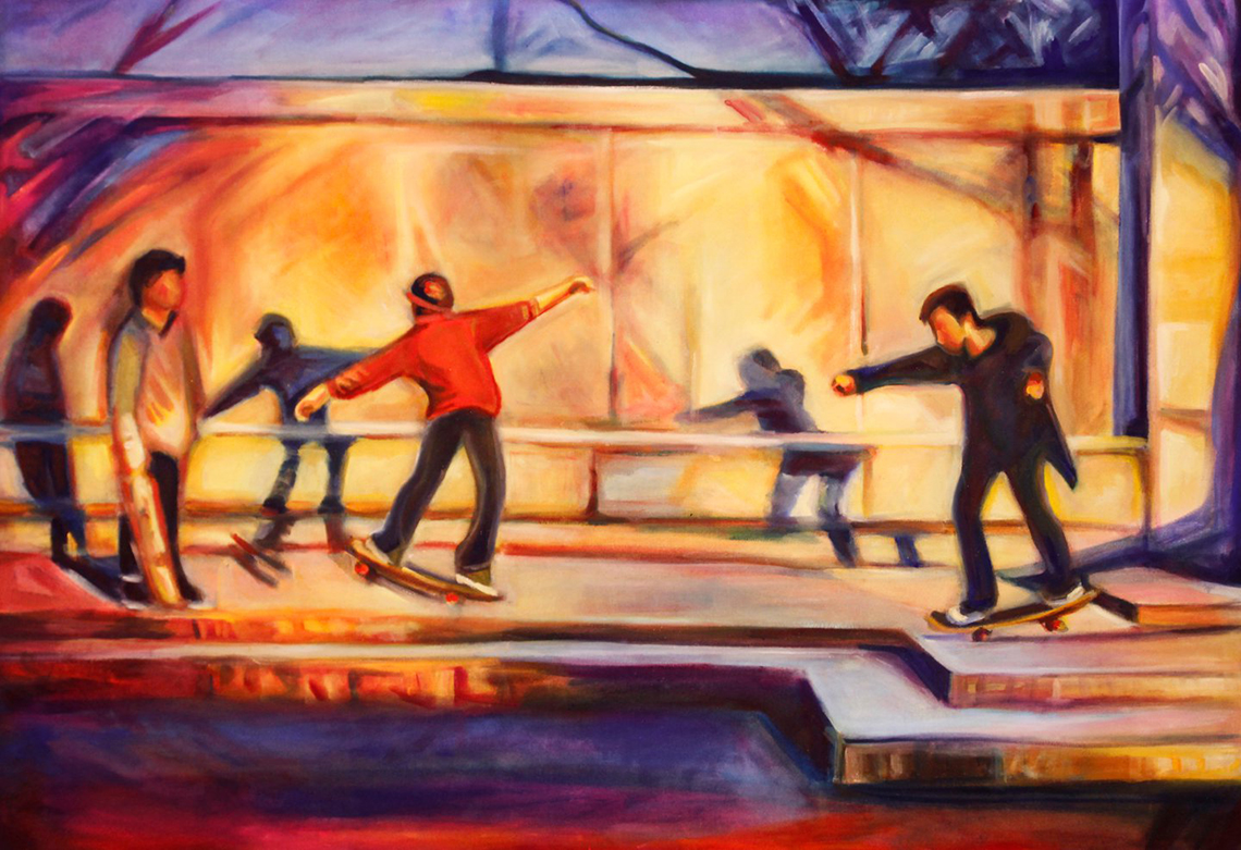
 I also used a similar color scheme for my skateboarders. It was another orange afternoon at the time, and I was enthralled with the lights and shadows.
Again, I used a rich mix of cadmium yellow, red, and lemon yellow for the lights. Then instead of cooler blues I used some cooler violet purples (mix of crimson and cerulean blue) for the cooler, contrasting parts (sky and bottom platform mainly).
The nice thing is that my cadmium yellow mixtures contain both orange, which is a compliment to blue, as well as yellows, which are compliments to purple. So I got a CHOICE whether to make my complimentary regions blue or purple.
How cool is that!
NEUTRAL USE
 I did not start out as a fan of neutrals. Give me a bold, bright, saturated hue over a neutral any day. However, I’ve slowly been learning that neutrals do have a great value and place in painting. You can’t show off brights without a bit of neutral to highlight the bold.
In my latest wedding portrait, I had a very “bright” landscape. However, it was mostly rock and stone. Great! I got to use a lot of my neutrals then. Here’s the breakdown:
Naples yellow –
a clean clear yellow neutral. It’s deceptively luminous and mixes very well with classic titanium white. I used it heavily for the sand. However, by itself it looks super blah. So used some hints of other neutrals, like Venetian Red (Rosso Veneto), Burnt Sienna, and Viridian green, as well as some “brights” like cerulean blue and cadmium red.
Wait? Can’t you see them all in the sand? That’s the trick. In the end, the color should appear to be “just” naples yellow, while retaining a deeper glow added by the back and forth use of many, many other colors.
Burnt Sienna –

a classic, “go to” neutral. It’s also surprisingly a bit of greenish color too. When I need a more netural green, I tend to mix it with ultramarine blue. A lot of my greens in the wedding painting are made with burnt sienna. It’s also a good “shadow” color for neutral shadows within the naples yellow sand.
Rosso Veneto (Venetian Red) –
a cheat red. It acts a lot like a redder burnt sienna, when you want red and not green. However, it is very, very flat and dull. So I tend to mix it with hints of brighter cadmium red. It’s also a good mixing color with brights when adjusting the tone or brightness. It’s good to mix with green to get a darker green. But I do tend to use it very little compared to my other paints.
 Viridian green –

BE CAREFUL with green. 95% of your greens should be a mixture of yellows and blues. ONLY use viridian green when you need the addition of compliment for red or to make a blue greener. I hardly ever use viridian as a color on it’s own. Greens are super easy to mix, and they come out more vibrant when they are the child of yellow and blue than when they come out of a tube already mixed. That said, I could live without it in neutral land. But use it cautiously.
Lastly, the rule of thumb for neutrals, is the more in the mix, the merrier. Use an entire array when you want to create that rich, pulsating netural.
This self-portrait was made almost entirely of neutrals. But since I used such a varied mix, I created a very “bright”, luminous color pallet out of them. Neutrals can indeed be bright.
–
Thus colors have endless personalities when mixed with different colors, analogous and complimentary. They don’t exist in a vacuum of warm and cool, bright or neutral. Any color can act as any element. But they can only do so with the help of every other color out there cooperating to achieve the desired result. Mix freely and often!
– Kate
For more information regarding warm and cool, analogous and complimentary, and bright and muted, see these two other entries: