Kate

A few of my many views on Color Theory…

It practically goes with out saying, but colors are one of the chief motivating elements for me in painting. I suspect that my romanticism with colors begins with color theory. I wish to discuss a few of own personal views on the subject, with just three beginning categories: Complimentary colors, Analogous colors, and Warm and Cool colors.

1. Complimentary colors:

OLYMPUS DIGITAL CAMERAIn my view complimentary colors are the first lesson to learn if you want to make your colors more bold and stand out more. Some art classes will teach monochromatic and analogous colors first, which does makes some sense. However, I feel like those first two are much more boring than compliments. One of my favorite art lessons back in early college was when I first painted yellow lemons with a purple background. It was simple, but just following that simple idea, took a mediocre painting and brought in an added “wow” element.

For those that don’t already know, complimentary colors are two colors at opposite ends of the color wheel. As the name suggests, when the two “opposite” colors are placed next to each other they “compliment” each other, make each other stand out more. Yes, purple and yellow are compliments, that’s why when you place bright yellow lemons against purple, the best of both colors are brought out “pop” that much more.

Complimentary pairs include: Purple & Yellow (think rich and elegant), Red & Green (think Christmas), and Blue & Orange (think athletic colors).

Sadly, when you actually mix compliments together, you get either black or mush (er, I mean “brown”). As a rule, you should never use true black in a painting (unless you have a very express purpose), so all my shadows and “blacks/darks” are actually a mix of compliments.

2. Analogous colors:

3707287077_06ba0494b4_b

I used to think analogous colors were kinda boring (and still sorta do). However, they are just as important. Analagous colors are those next to each other on the color wheel. There are more combinations of pairings involved like: Green & Blue, Blue & Red, Red & Orange, Orange & Yellow, or Yellow & Green.

The best thing about analogous colors, is that they mix very well, and can create that exact tone, temperature, or shade/hue of color you want. If you have a green and want more coolness, add some blue (which of course is an ingredient in green: blue & yellow). If your red is too bold and you want to soften it a touch, without loosing the drama, add some orange or yellow (an ingredient in orange: yellow and red).

I kept mentioning “an ingredient in_” because in my view, that’s one of the most important lessons with analogous colors. If yellow is a main ingredient in orange, then wouldn’t orange and purple have some sort of distant complimentary relationship too? And if red and blue make purple, then wouldn’t red, blue, and purple be an analagous combination that would look great against yellow (like in Dancer) or orange?

In Dancer, I used that red and blue (and therefore purple) analogous pairing. And from there I used just a touch of yellow to create the complimentary lights that “pop”. Analogous colors, at least in my prejudiced mind, might not always be the most glamorous, but without their flowing and mixed pairings, there would be nothing to place those dramatic compliments against.

And yes, I have a particular fondness for yellow and purple compliments when I can get away with it.

3. Warm and Cool colors:

OLYMPUS DIGITAL CAMERAOne of the more psychological and intuitive (and therefore one of my favorite) aspects of color theory are “warm” and “cool” colors. When you think warm/hot, most would say “Red, orange, yellow” and cool would be “blue and purple” with green in between. Generally speaking, warms stand out more for “foreground” images, and cools are more for “background” elements. That’s the initial lesson, however, there’s so much more to it!

Not all reds are truly “warm” and not all blues are actually “cool”. This is where it gets a bit hard to describe, but certain blues are a lot warmer than others. I personally consider cyan, or sky blue, to be a warmer blue than aquamarine blue. Maybe it’s because I see a “cool ocean” in aquamarine blue, or I see a “warm sunny sky” in cyan. Therefore, you never have to be stuck using just reds in front and blues in back. If you have a blue object in the foreground, you can either choose to use a warmer type of blue, or a cooler red (like a crimson) behind it. OR if you really want a challenge, use true cool colors for all your foreground elements and true warms for the background, and see what an unusual, dramatic vibrancy they create.

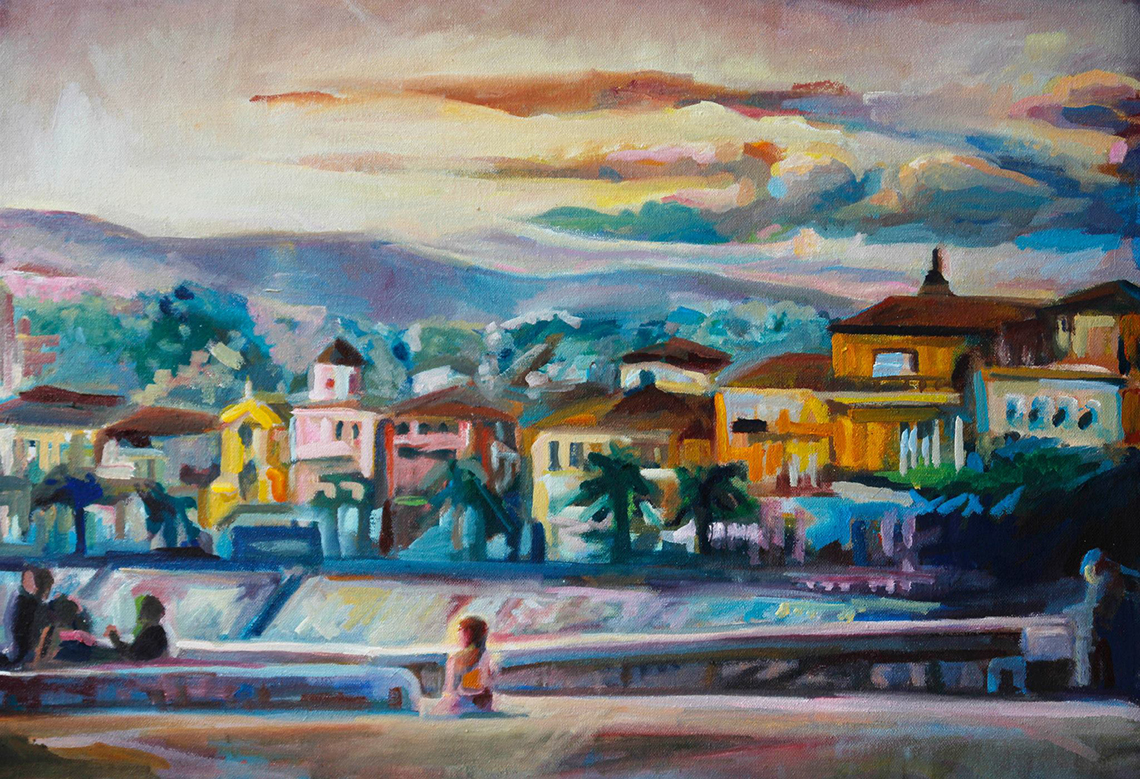
One of the first times I attempted using the unusual palette of cools in the front and warms in the back was in this pastel from Arezzo, Italy. It’s a pretty simple piece, just the trees, but this has since become one of my favorite color palettes, and I learned a lot from there.

Color Theory in Action:

5572638563_44a3cda76b_o1

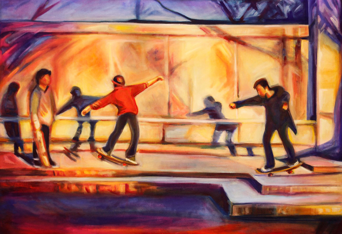
In Are We Human, Skateboarder 1, I used an analogous combination of yellow and orange for the center and then deep blue to purple shadows along the edge. Blue is the compliment of orange and purple is the compliment of yellow, so I was really happy about how well it all coalesced.

At the same time, I generally aimed for an idea of a “warm” sunset, so even though I used both blues and oranges, the entire piece gives off a warm vibe, while still representing a hint of chillness that comes when the sun sets. The crimsons I used (mixed with some yellows to make some of the oranges) are cooler reds to reflect the diminishing sun.

MG_7062yayIn Are We Dancers, I used similar colors, but to a different effect. I used more yellow and less orange, and more blue, less purple. Since my compliments weren’t as exact, my blue shadows and yellower highlights don’t contrast as much, but form a softer, more pleasant feel. I also used some green in the center top, which works well, as green is the center of the color-temperature spectrum.

But I can’t hold back that much. With all the soft and colorful lighting, I then get to make the focus the guy’s bright red shirt which stands out and makes him the center. Since I held back and only used my warmest color in the center, I get to make the statement that this guy, who I equate to a “dancer” (hence the title of the piece) is important. I don’t have to explain why or say it in words- I get to just let the colors say it for me.

Color theory is a language art uses to make its statements without words.

All the bests,

Kate

For more information regarding warm and cool, analogous and complimentary, and bright and muted, see these two other entries:

Part 2

Part 3

Kate

Even MORE of my many views on color theory – Part 3

Ironically, in opposite to the title of this post, I don’t often choose a palette when starting a painting. More often, I let my subject inform the colors. And generally I choose to paint an image based on the colors already present. I hardly ever choose to paint an image that does not have amazing colors. Thus, choosing a palette isn’t so much of “choosing” as “finding” colors that already exist within the subject.

With that said, there have been a few times where, as an exercise, I’ve tried to consciously choose a color palette, or to be more deliberate with choosing my colors. I feel like choosing is a different act and has it’s own advantages and drawbacks to finding a palette. Hopefully, using a little bit of both helps conceive a painting with a strong, clear color scheme and produce stronger work.

Here are some specific choices I’ve made in color palettes, as well as a description of their purpose:

Roma and Nice pink and purple sunsets:

10403363_818059474870806_1695206765269098513_620I just completed my “honeymoon” series, where I painted one image from each of the four cities we visited. I wanted views that weren’t typical, but still were indicative of the cities they represent. Also, I found that I typically took pictures during the best time of day for lighting: near sunset.

Each sunset was captured on a different day and in a different location, so they were each very unique. However, I found that I could use color to connect the two. I deliberately used a very purple and pink palette for the incredible lighting.

T14962c9e104d29d824bd4639067a2_620he neat thing about painting, is that even when using similar colors and purposefully choosing a scheme, the subject still imposes it’s uniqueness through the colors. For instance, The Roman street painting (bottom) matches Nice (on the top), with it’s warm pinks in the center. But towards the edges, it suddenly diverges into deep aquamarine blues, representing the cool, deep shadows of near sunset on an urban street.

Nice, being an airy resort town, has more warmth, but still touches upon some deeper ultramarine shadows (and prussian blues) near the edges too. It’s a lesser amount, which lends Nice a warmer representation. It’s cool that the same colors, but in different amounts, can create two different locations.

In both cases, I used ultramarine and prussian blues for the shadows. I used naples yellow and white plus alazarin crimson for the warmth. Prussian blues are a bit heavier, flatter (duller or muted) and warmer than ultramarine blues, so they lend a warmth to deep shadows, versus ultramarine, which gives shadows a bright coolness. Nice’s warmth was so warm, that I used more prussian blue, so that the shadows were warmer and didn’t cool-down the scene. On the street in Rome, the shadows were more bright and lively, but cool. The ultramarine represented the hustle and bustle well. Also, it was more complimentary to the warms. Nice was a lot more analogous in its warmth. But both still contained contrast and information about the atmosphere and locations based on the use of blues verses reds (which verge into oranges and yellows). If you want to go analogous but still have contrast, using colors from separate ends of the color wheel is a good choice.

Venice and Paris ultramarine and orange sunsets:

ef4d9f70a4af4d9ee7e83921804a72d620

These next two paintings still related to the purple-and-pink-er ones above, but they use slightly different palettes.

I used a lot more orange and ultramarine in both. Both of these paintings represent a slightly earlier sunset hour when the sky still displays a more daytime-like blue sky. But when the sun gets so low, the clouds (Notre Dame, below) and reflections (Venice, above) gain contrast and become this awesome brownish orange, which contrasts against the bright ultramarine and cerulean skies or water.

10320272_816310565045697_5552355361423349829_620

Again, these images also have their differences, also informed by their color use. In Venice I used some purples in the near walls against a much more orange and warm walls in the back where the sun was still hitting. I used a LOT more ultramarine in the water in order to make the warm tinges of colors, reflections in the water.

In Paris, some purples were used in the water, but I use more flat, dull reds in the silhouette shadows of the cathedral in the distance, and the trees. The trees of course are “green” but in the sunset they are dark. Thus, I use a warmer, deep flat cadmium red plus blues and viridian green (an invisible compliment in order to darken the red).

Normally, blues make something recede into the distance and reds make something advance to the foreground. However, in both paintings I enjoyed flipping that so that the red-ish oranges in the distance clouds and distant walls represent the distance and that the ultramarine blues and purples and in the foreground. It’s neat to me that you can manipulate the natural properties of colors so. There is almost a limitlessness to how and where you can use colors.

compcherry2Lastly. The above series was where I really took palette-choosing seriously. I wanted to capture the same spot, in three different times of day. I used the color wheel from red to blue – purple to cycle through the day. I wanted to show how the peaceful pinks in the left-most can say tranquility, how the green can show busy nature. And lastly the blue can be a cool busy twilight/ evening.

What’s I always find neat is that while the first is red, I had to use blues and green “invisibly” in the shadows to create contrast, even if still analogous. And in the green, I had to use blues and reds to warm up and cool down parts. And in the last blue one comes full circle (that’s why it’s a color wheel and not a color line), almost back to red – I had to use reds to create the purples.

—-

I hope this shows how, while intentional colors are important, the act of choosing a palette is so much more than just your own choice. So many other factors and elements come together to form a successful palette. Besides, no matter how you limit or expand your palette, ALL the colors are needed to form depth, contrast, shadows, and highlights. An intentional palette can be decided by differences in usage and amount of certain cool or warm, bright or muted colors.

For more information regarding warm and cool, analogous and complimentary, and bright and muted, see these two previous entries:

Part 1

Part 2

Kate

A few MORE of My Many Views on Color Theory

Note: I’d read this previous blog post on color theory first before starting this post, as I might be using some terms in this post, that were first explained in the previous post.

One area where I differ from many other artists, is that I don’t plan my color schemes ahead of time. However, that doesn’t mean that the color schematic I end up using for a particular piece aren’t purposeful. Here I want to elaborate on a few different ‘schemes’ I use frequently.

NIGHTTIME / Light against Darkness

4710240253_cecf846b1a_b11620Personally, I find painting illuminated objects against the dark to be one of the easier color schemes. With daylight, you have to discover the luminosity of a subject yourself, but with illumination in the night, it practically dictates the answer for the lighting for you.

But back to color schemes… for a night scene, I generally use my richest darks, generally ultramarine and prussian blues against some bright cadmium reds and crimson/purples. Here’s the key to the purpose of the individual colors:

Prussian Blue –

A WARMER blue, that is extremely dense and dark. Prussian blue advances to the foreground of a piece, while still retaining a cooler background feeling. Blues are cool colors, but there are warmer blues than others. Prussian is one of those warmer blues, so think “foreground blue”.

Ultramarine Blue –

A COOLER blue, that is more transparent and light. I use a boat load of ultramarine blue in any painting, because it takes many layers to get it thick enough to use as a color on its own. It’s also a very cold color, and is one of the best receding blues I use for skies and background.

Cerulean Blue –

A lighter WARM blue that adjusts the tone of both prussian and ultramarine blues. It also makes a nice violet, purple with alazarin crimson. I also use it when I need a lighter prussian or ultramarine blue.

Alazarin Crimson –

A COOLER red, that is very thick and dark. Again, reds are warm by nature, but some are cooler than others. I use more crimson than any other red. It is wonderful for mixing purples, but warm (when mixed with cerulean or prussian blue) and cooler (when mixed with ultramarine blue). Crimson plus prussian, creates my deepest, most solid dark. However, that dark looses a lot of detail within it, so then I use either ultramarine blue or cadmium red to restore details and lighting flavor.

Cadmium red –

A HOT HOT HOT reDSC086731300d. Cadmium red is the first color to hit the eye, so I use it sparingly and with purpose. It is a great color for highlights in the dark, as it really stands out. It also adds perspective to a work, by showing off a foreground, created by its warmness. I also use it to create warmer purples with various blues.

Lastly, as you can see in the DC skyline painting, that I used a fair amounts of yellows for the true lights (like in the Capitol building). However, more of the canvas is covered by these rich varied darks than it is by actual lights, that’s the great thing about night lights – they are an entire spectrum of rainbow colors where you least expect them – in the dark!

One added painting with similar use of colors is the stained glass from the National Cathedral (shown left). This time, I used copious amounts of alazarin crimson instead of blues for the darkest parts. Because this was a much warmer painting in general, compared to the DC skyline painting with had a cooler sky and water. This was a hot sun- through- window painting where I used crimson (still mixed with some subtle blues) for the dark. Instead of large amounts of yellows for the light, I started using a lot of lighter greens (mixing blues and yellows), because green and red are compliments. The greens (along with the delightful juxtaposition of yellows and blues), become much more luminous against the reds, and thus are transformed into the true, colorful light source. Light is not just yellows, but a whole array of colors.

Both darks and lights are composed of entire spectrums of colors!

AFTERNOON LIGHT

3707292903_fbcdd25629_b620ORANGE! I love orange! The best time of day is when the sun starts getting lower in the sky, and through some miracle of the atmosphere, starts streaming orange against structures.

I was lucky to walk by the Supreme Court on one special day where the lighting against that “white” building was vividly orange. I loved painting that color in that scene later. Here’s the breakdown of that color scheme:

Cadmium Yellow –

Actually more of an “orange-ish” yellow. It’s a very solid and opaque ‘yellow’ that mixes great with cadmium red to create a very true, warm orange. As I wanted the entire top of the building to be super hot-warm, I varied the tone of the cadmium yellow from redder (further to the back) to yellower (closer to the front).

Lemon Yellow –

A COOLER yellow. Of course, yellows are naturally warm, but again, some are cooler than others. By itself, lemon yellow doesn’t create the warmest light. It might create some of the brightest light, but NOT the warmest. Thus, a mix of cadmium red (again, a HOT red) and cadmium yellow must be used in addition to really create a hot orange afternoon light.

Lastly, you can see I used a mixture of cool blues for the cooler parts of the painting (towards the bottom), because they contrast nicely with my hot orange. I also used the cool blues sparingly within the warmer columns themselves inorder to show details and variation in how the light is striking the columns/pillars.

5572638563_44a3cda76b_o1620I also used a similar color scheme for my skateboarders. It was another orange afternoon at the time, and I was enthralled with the lights and shadows.

Again, I used a rich mix of cadmium yellow, red, and lemon yellow for the lights. Then instead of cooler blues I used some cooler violet purples (mix of crimson and cerulean blue) for the cooler, contrasting parts (sky and bottom platform mainly).

The nice thing is that my cadmium yellow mixtures contain both orange, which is a compliment to blue, as well as yellows, which are compliments to purple. So I got a CHOICE whether to make my complimentary regions blue or purple.

How cool is that!

NEUTRAL USE

MG_6979edit21I did not start out as a fan of neutrals. Give me a bold, bright, saturated hue over a neutral any day. However, I’ve slowly been learning that neutrals do have a great value and place in painting. You can’t show off brights without a bit of neutral to highlight the bold.

In my latest wedding portrait, I had a very “bright” landscape. However, it was mostly rock and stone. Great! I got to use a lot of my neutrals then. Here’s the breakdown:

Naples yellow –

a clean clear yellow neutral. It’s deceptively luminous and mixes very well with classic titanium white. I used it heavily for the sand. However, by itself it looks super blah. So used some hints of other neutrals, like Venetian Red (Rosso Veneto), Burnt Sienna, and Viridian green, as well as some “brights” like cerulean blue and cadmium red.

Wait? Can’t you see them all in the sand? That’s the trick. In the end, the color should appear to be “just” naples yellow, while retaining a deeper glow added by the back and forth use of many, many other colors.

Burnt Sienna –3708093108_afc9f37f78_b620

a classic, “go to” neutral. It’s also surprisingly a bit of greenish color too. When I need a more netural green, I tend to mix it with ultramarine blue. A lot of my greens in the wedding painting are made with burnt sienna. It’s also a good “shadow” color for neutral shadows within the naples yellow sand.

Rosso Veneto (Venetian Red) –

a cheat red. It acts a lot like a redder burnt sienna, when you want red and not green. However, it is very, very flat and dull. So I tend to mix it with hints of brighter cadmium red. It’s also a good mixing color with brights when adjusting the tone or brightness. It’s good to mix with green to get a darker green. But I do tend to use it very little compared to my other paints.

3839605371_515226d3f6_b11Viridian green –

BE CAREFUL with green. 95% of your greens should be a mixture of yellows and blues. ONLY use viridian green when you need the addition of compliment for red or to make a blue greener. I hardly ever use viridian as a color on it’s own. Greens are super easy to mix, and they come out more vibrant when they are the child of yellow and blue than when they come out of a tube already mixed. That said, I could live without it in neutral land. But use it cautiously.

Lastly, the rule of thumb for neutrals, is the more in the mix, the merrier. Use an entire array when you want to create that rich, pulsating netural.

This self-portrait was made almost entirely of neutrals. But since I used such a varied mix, I created a very “bright”, luminous color pallet out of them. Neutrals can indeed be bright.

Thus colors have endless personalities when mixed with different colors, analogous and complimentary. They don’t exist in a vacuum of warm and cool, bright or neutral. Any color can act as any element. But they can only do so with the help of every other color out there cooperating to achieve the desired result. Mix freely and often!

– Kate

For more information regarding warm and cool, analogous and complimentary, and bright and muted, see these two other entries:

Part 1

Part 3